Jack Rush's Music Video Blog
My personal blog describing and updating teachers/examiners on the progress of my media knowledge and the progress of my media production: A Music Video. Throughout the course I will analyse multiple music videos and discuss their Mise en Scene, Conventions and the directors other similar productions to understand the way they work.
Saturday, 5 March 2011
What have you learnt from your audience feedback
Monday, 28 February 2011
How did you use new media technologies in the construction and research, planning and evaluation stages?
 During the construction of our music video we used new media technologies to help produce, edit and showcase our video. The software we used most was as expected our editing software Apples Final Cut Express. This is the first time we have had to use Final Cut Express as in last years project we used more basic software called Imovie. At first final cut express seemed to over complicated and we found it very frustrating to use, however the frustrating period didn't last long as Warren became confident and capable with the softw
 are. Warren also studies Film Studies so he has had to use the software much more than me and Ryan so because of this Warren generally did most of the editing. As well as the new software we have used this year we have had the chance to use high definition cameras which has dramatically improved the quality of our film. To get used to the new software we had to produce a mock music video using songs the school had been given permission to use, our song was I Need Your Pain and was lip synced by Warren . After we finished editing the preliminary exercises we uploaded the short clip to YouTube, the Internets most popular video website. There is a link to our preliminary exercise below.
(http://www.youtube.com/watch?v=MdkZd1K-IGs&feature=player_embedded)
 As for research I created a survey using http://www.surveymonkey.com/ which is a great free website which allows you to create impressive quality surveys without paying a subscription fee. I created a survey to find out some key information about the music video market to find out what appeals to today's audience and who we are most likely to target with out music video. My survey consisted of only five questions but I made sure they were sufficient enough to retrieve the information we needed, I tried not to ask closed questions such as "do you like watching music videos" because we would not benefit from a question which would ob
 viously be answered yes by the music video enthusiasts we ask. I also created a survey which I asked 15 people to take part in after we had finished our video to see how our video affected its viewers. Survey Monkey was a very useful tool that allowed us to retrieve feedback on what we had produced and give us information and the criteria we needed to attract our key audience.
Wednesday, 23 February 2011
How effective is the combination of your main product and ancillary texts?

I think that our ancillary texts: our Poster and our Digipak create a brand identity for Tweed. Having our poster and album front and back cover the same simple tweed material makes people who have heard of Tweed instantly recognise any of their other material. An example of an artist who has a brand identity is Mike Skinner from The Streets. For his first two albums Mike Skinner kept the CD design very plain with just the title and the Streets lighter which is instantly recognisable not just because o
 f the name. The choice of a lighter can also be related to The Streets as his first album Original Pirate Material had heavy influences from drugs and the youth drugs culture. When the album was released it wasn't an instant success and after time it became highly praised by surprisingly older audiences and was popular with people from all classes. Original Pirate Material was voted album of the 21st century by The Guardians Ben Thompson which is an impressive feat for a debut album.
 As for the rest of our digipak I am very pleased with how the other images compliment each other. We have the powerful image of Ryan in the rear view mirror which is located on the inside cover as you open the CD case. If you unfold the slip in the inside cover we have the images of the forest where we filmed the car scenes with the Tweed logo and the track list. At first we found it difficult to select what would go in the digipak however after a few lessons of brainstorming while editing we decided that using the images of the forest in the digipak would be suitable. We decided on the images of the forest because of the common things associated with forests such as murderous activities and bodies being found by joggers and so on. The link may be over exaggerated however it does link in the subjective storyline of our music video, it can be seen as he may have ran her over and disposed of her in the forest. A very dramatic link but a significant one.
 As I said before we wanted to make Tweed an instantly recognisable brand and I am really pleased by our poster. Most of the time adverts and posters for bands are egotistic or trying to create an over artistic impression of the band, like the image on the right for a group I have never heard of. The image for The King Blues tries to show the group in a way which is a
 ppealing to a young audience, however the simple shot of the band may attract some consumers but it is more likely to have the opposite effect with the majority of consumers. Trying to show a band in a "cool" way is risky, modern day examples are Lady Gaga who has pulled it off with her odd sense of fashion and attention seeking acts. An example of a group who failed to pull the "cool" look of are The Kooks, The Kooks achieved relative success with singles such as "Niave" and "She Moves In Her Own Way" in the UK music industry however they have came across some harsh press such as Simon Amstell (Never Mind The Buzzcocks) calling them "Brit School rock star wannabees". So by deciding to keep the poster simple and not trying to show Tweed in a "cool" way if
 our production was to be released on the market it would be hard to find any attacking comments about Tweed in the press. Our poster is a neutral inviting advert for consumers to make their opinions of the band after they have heard the music, whether positive or not after they have purchased the album the advert has achieved what it had set out to.
Friday, 18 February 2011
In what ways does your media product use, develop or challenge forms of conventions of real media products?
 Our music video is about relationships. Most conventional music videos about relationships are about the woman seeking revenge for issues caused by the man in the relationship, however the male in our video has more serious thoughts than just seeking revenge. The title of the song I RanYou Down immediately gives the audience and idea about the story line of the video. We used the songs lyrics to our advantage to create a red herring whether he actually did run over his girlfriend. The storyline and message of our music video is subjective, there is no definite ending, at first we wanted to create three endings and let a focus group decide which one was most effective. However one we began filming we realised we didn't have appropriate material and locations to film all three.
 While we were researching successful music videos in class we came across My Favourite Game by The Cardigans, at first the videodidn't seem to make much sense, but after a while i grew too like it. I had never seen the video before but had heard the song. The video was produced and directed by Jonas Akerlund over three days in the Mojave desert in California, and was rumoured to have cost £220,000. The video shows the bands lead singer Nina Persson recklessly driving an old car through the desert trying to make other cars crash. At the start of the video she is trying to find a suitable rock to keep the accelerator onto make sure the car will continue if she jumps out. So at the very start of the video we know she has plans to crash the car, the title My Favourite Game g
 ives makesyou believe she is playing sort of Russian Roulette . The video created some controversy when it was first released in 1998, the video was consequently banned or an edited version shown where all of the crashes and the dangerous driving were taken out. Jonas Akerlund knew the video would cause some controversy so he created five different versions with varying degrees of violence and blood. Many European channels including MTV UK only played an edited version of the version of the video because they believed it would cause and increase in "joyriding" and cause car accidents amongst teenage drivers. The video achieved substantially success and was placed at 95 on channel 4's 100 greatest music video.
We watched this video a few times before filming the car scenes to give us some ideas about different angels we could use, at first the carscenes were very difficult to plan. After watching the video we discovered some easy and effective shots, however once in the car on the day we found it difficult to replicate the angels we had seen. We managed to replicate a few of the angels in the Cardigans video, the image on the left shows one of our basic angels the "rear mirror view". What we aimed to do was take some of the aggressive driving seen in My Favourite Game but do it in a controlled way which was safe but looked realistic in order to produce the red herring; was she run over or not?


Tuesday, 15 February 2011
Friday, 4 February 2011
Editing
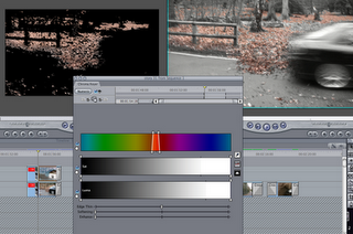 Today while editing our music video we came across an effect which would create some good contrast in our black and white car scenes. While filming we covered the road with leaves and as the car drove past the leaves were sent flying by the wind. We decided to keep the leaves their original colour of golden brown and leave the rest of the scene in black and white. The effect was simple to edit, however after trying different colours and shades we were unable to make all the leaves in the scene orange. In the scene there are patches of leaves in black and white however a majority of the leaves are colour golden brown how we wanted them, and because the scene is only a second or two we were confident it wouldn't be noticed.
Tuesday, 18 January 2011
Digipak: Jamie T, Panic Prevention
 Jamie T's debut Mercury prize nominated album Panic Prevention was released on the 29th January 2007 and sold over 160,000 copies in the first year. The album was a big success for the Wimbeldon born singer and lead to his second hit album Kings and Queens. The album achieved most of its success from singles such as Shelia, If You Got The Money, Ike and Tina and So Lonely Was The Ballad. The album was named Panic Prevention because Jamie T (real name Jamie Treays) suffered panic attacks throughout his teenage years, and the album is a series of songs showcasing events and feelings.
 What I like about the album cover and the digipack is the cluttered mess where Jamie lays and the contrast of the background with the war medals. The medals do not directly link to the songs in the album but do make a good back cover, unlike some albums the track list are display
 ed simply which is what we wanted to do. Keeping a simple album cover isn't really popular in the media industry
  portant choice which means more than just the aesthetics. The repetition of the words represent an actual panic attack with someone in a confused state struggling to ommunicate. What i like about the repetition of the words is that in some places the words are cut off which centers the complete title. Where as the image above on the left hand side is an example of artistic creativity some artists choose to display on their CD's
 Saturday, 15 January 2011
Car Scene Filming
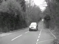 We are approaching the deadline for our music video in the second week of February and today we filmed our car scenes. After research we were all confident that we could produce some impressive shots and angels, and when we were out filming we experimented with various angles, which in the end saved us as we lost a proportionate amount of film due to recording mistakes. We did the best to salvage what we could and the little experimental shots drastically improved the quality of our music video.
Monday, 10 January 2011
Poster
 Over the past few weeks as well as editing our music video we have been producing our poster and our digipack. The poster was quite complicated to produce because at the moment we do not have the film from the car scenes to take images from, and our band Tweed are not a normal mainstream band so there are not many conventional ideas we can use. The image on the left was our first draft of the poster, the image which is quite powerful did not really represent Tweed and is more suited to an American soft rock boy band so we began again.
The image on the right is our second attempt at creating our poster, the image unlike the first is subtle but effective. The image was taken by filming the playback screen on a video camera, during the editing stage of our video we cropped the image while brainstorming for ideas for the poster.
 hings simple when it came to the Digipack front cover too. We decided to keep the album plain because our song I Ran You Down limits you too a car shot or a band pose like our first draft of our poster. The whole idea of our video is that it is subjective there is no definite ending, so we decided that having a plain album cover would make it more interesting for the audience to pick up and wonder what the album is about. Just to avoid confusion the darker patch on the bottom left of out poster is the album cover.
Friday, 7 January 2011
Bad News!
Tuesday, 28 December 2010
Filming Progress!
 Today we filmed three of the scenes we aim to use in our music video. All the scenes were shot in Ryan's house, the scenes we filmed today were involving the two main characters who have an argument. Today we obtained twenty to thirty minuets of film which we will use through out the video, tomorrow we will begin editing the film however the first draft deadline has passed so time is of essence.
Sunday, 26 December 2010
Filming Timetable
Tuesday, 21 December 2010
Costume
Thursday, 16 December 2010
Bloc Party- One More Chance
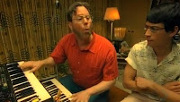 One More Chance by Bloc Party is an interesting video which is a subtle parody which doesn't make you connect with the song straight away. The song is obviously about a relationship however the video seems to show odd characters trying to live the "American dream" of becoming rich and famous. Th
 ere is a 40 something keyboard player/music producer creating songs in his basement studio. An older woman who also seems to want the Hollywood lifestyle, she is seen covering her self in make up and hair spray and trying to resemble Marilyn Monroe or a prom queen. A young talentless tap dancer dancing in his homemade studio w
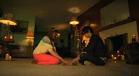 hile a friend is watching unenthuastically. The final characters in the video strangely are a young couple playing with a Ouija board trying to connect with the dead. This strange twist to the video doesn't make much sense however you can still connect to the representation of mainstream Hollywood.
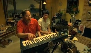 What I most like about this video is the Mise en Scene of all of the scenes. They seem low budget but they all match the characters that are shown in the scenes perfectly, the underground basement studio in particular; the cluttered mess of records, dodgy coloured curtains and the garden gnome really give you a sense that it is being filmed in his parents basement. Also the scenes where the couple are playing with the Ouija board, the clothing is a new "retro-vintage" fashion, the room consists of an old looking
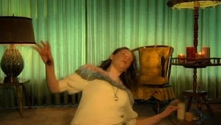 pale pink carpet with loads of stools and vintage lamps surrounding the room. I mostly like the way they use the lamps when the girl is supposedly taken over by a spirit. All in all I think this is a good video which can be analysed in many ways, Bloc Party were known for the slightly odd videos, but I believe this one attacks the issue of the American dream and shows some of the weird behaviour wanting fame so much can bring about.
Wednesday, 8 December 2010
Deadline Time
 As the first draft deadline approaches it is clear that we are struggling to produce enough film. This has mainly been because of the bad weather of the last week or so making the driving scene too dangerous, however now the person who had agreed to spare some time to help us do the scene and drive the car has chicken pox. It may seem like a made up excuse, unfortunately it is not. Currently we have all the footage reuired for the band scene however we now need to film the car scenes and some footage in the characters house. Today the weather forcast for next weekend is not looking promising snow is on the way.
Tuesday, 30 November 2010
Unavoidable Problems!
 Today was the day that the first of the winter snow hit London and Essex which has created some problems. We had planned to start filming the car scenes on saturday, however snow and ice on roads creates many problems and also does not look very nice. Originally we wanted the car scene to be filmed down a road with trees towering over each side and golden brown leaves covering the floor, however the reality of this happening is now very slim.
Wednesday, 24 November 2010
DigiPacks
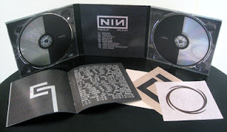 Today we started researching Digipacks and discussing what we should do to create our own DigiPack. A DigiPack is simply the CD cover, beck page with song listings and the booklet inside the CD which normally consists of song lyrics, notes from the band and a "thanks to list". For our DigiPack we still have not decided on a final idea, however we been discussing using some of the locations in our video such as the forest scene. I am looking forward to creating the DigiPack and think it will be an enjoyable experience.
Also we have now completed the filming for our band scenes, however we still need to film the remainder of the scenes.
Monday, 22 November 2010
Music Video Band Scene Teaser
Saturday, 13 November 2010
Shallow Focus
Below is a video by Majestic Micro Movies displaying Shallow Focus:
We want to use shallow focus for two scenes in our music video; one of the scenes is within the opening 20 seconds and will involve a close up of the charcters face as he closes his eyes, the shot will run along side the lyrics "I closed my eyes and you were there". The other will another close up of the main charcter for the last verse "life is such a funny thing, you lose your love to love again , then you start again."
Friday, 12 November 2010
Animatic: I Ran You Down-Tweed
NOTE: The scene from 0:16-0:32 shows a couple at first having fun/reflecting on good time in the past, when the screen turns red its the same scene however they are having an argument.
Tuesday, 9 November 2010
Framing and Camera Angles: The Streets- The Escapist
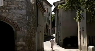 The video for the single The Escapist from Mike Skinners latest album Everything is Borrowed has a very simple basic video which was done while he was touring Europe. The video simply just shows him walking down roads, up hills and through doorways. The locations the video was shot in make the video interesting for what could of been called a boring video. As I said before nothing really happens in the video however it somehow suits the s
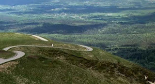 ong. I don't think that another artist could get away with making a video like this however Mike Skinners unique style and meaningful lyrics allow him to create songs which are not mainstream however receive similar amount of success.
"During a great period of intense mixing we decided that it might be nice to shoot a video. This isn't the way the record industry works and so it was under the radar of the label and done totally for us by us on a shoe string. It was totally different from any other promo that I've made in that it was something real that we just filmed rather than trying to create something real looking using lots of people and lots of angles. I feel like it's more than a video in that sense. As well as looking quite odd without all the singing and quick cuts"
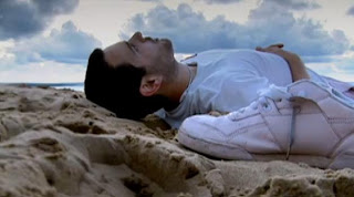 I think that it was a brave choice by The Streets to create this video and i admire the honesty normality of Mike Skinner and his public comments. In another of The Streets videos on YouTube, "Everything IS Borrowed" the description reads "An artistic piece of credit crunch drama. Album is out September 15Th." The simplicity of his words seem to have more of a meaning than a big advertising campaign, it may not appeal to as many people but it portrays him in different way to "billboard artists".
 The video its self seems to tell a story which can be portrayed in many ways, to me it seems as if the main character (Mike Skinner) just wants to get away from everything. The title obviously points this out but the lyrics seem to point to him just wanting to think things over, he seems trapped the lyrics seem to support this"All these walls were never really there, Nor the ceiling or the chair Im' eking weeks of peace at the beach, I see the breezes weave the trees." I have the understanding that the song is about a point in someones life where they just want to escape reality and think things over. The locations in the video are the peaceful places he wants to escape to and through out his journey he is alone, until the final scene on the beach where he is with what seems as his friend who takes him back to reality.
Tuesday, 2 November 2010
Problems With Filming Inside a Car

As you can see from the previous post we recently experimented with camera angels we could use within a car. This was valuable experience that has made us realise how hard or impossible it is to film certain shots. One of the main problems we had was the limited height we had to get certain angels, this was because the car we used was a small three door hatch back. This is not the car we intend to use in
 our video, the car we aim to use is slightly bigger and more spacious. There was many things we had avoid such as; the camera appearing in the reflection of the mirrors, headrests getting the way and being to close to the front seats. The image on the right shows the main problem we came across when trying rear view mirror shots, we tried for around five minuets to get one shot of me in the distance. The problem was the low archer rear window of the car, in the car we aim to use in our video this problem will not
 occur the rear view mirror is wide and clear. In the photo above I was thirty one meters away from the car which would be the reasonable distance for a shot when the car is moving. Also the car we used was quite small inside as the picture on the left shows, but as you already know the car we wish to use in our video is proportionately bigger inside and suits the theme of the video more than the small hatch back we used to experiment.
Monday, 1 November 2010
Filming Inside a Car: Finding Plausible Camera Angels
 Today we took out a digital camera and borrowed a friends car to try out angels we wish to use in out music video. We tried a number of angels from inside the car, outside the car, shots through the wing mirror, rear view mirror, in front of the car and from the side. We aim to use some slightly complicated camera angels within our video so this experience is vital to determine the practicality of the sh
 ots. Our current story board contains around five or six car scenes which involve a character getting into the car after having a row and driving off fastly, many point of view shots inside the car, low angle shots of the car passing by, our character looking through the mirrors at other people and many mid shot scenes while the car is moving. We understand filming some of the shots where the car is moving can be quite dangerous howeve
 r before the actual shoot we will have a trial run. The image just above shows one of the shots we wish to use in our video, we want to use this shot as our character drives past his girlfriend (who he has had an argumentwith), we will film an over the shoulder shot of him ignoring her ashe drives past then cut to a shot of her looking at him in the wing mirror. I think this would give our video an effect which improves the te
 chnicality of the video which would award us more marks than if we had not used it. At the moment we have many ideas and are excited to start filming, however filming can be stressful and complicated and could take many attempts to produce one good quality scene. We are feeling confident that our video has a good balance of shots and scenery and we have started thinking of who will play which characters.


